← Blog Design
Design
The map, redrawn as a paper survey
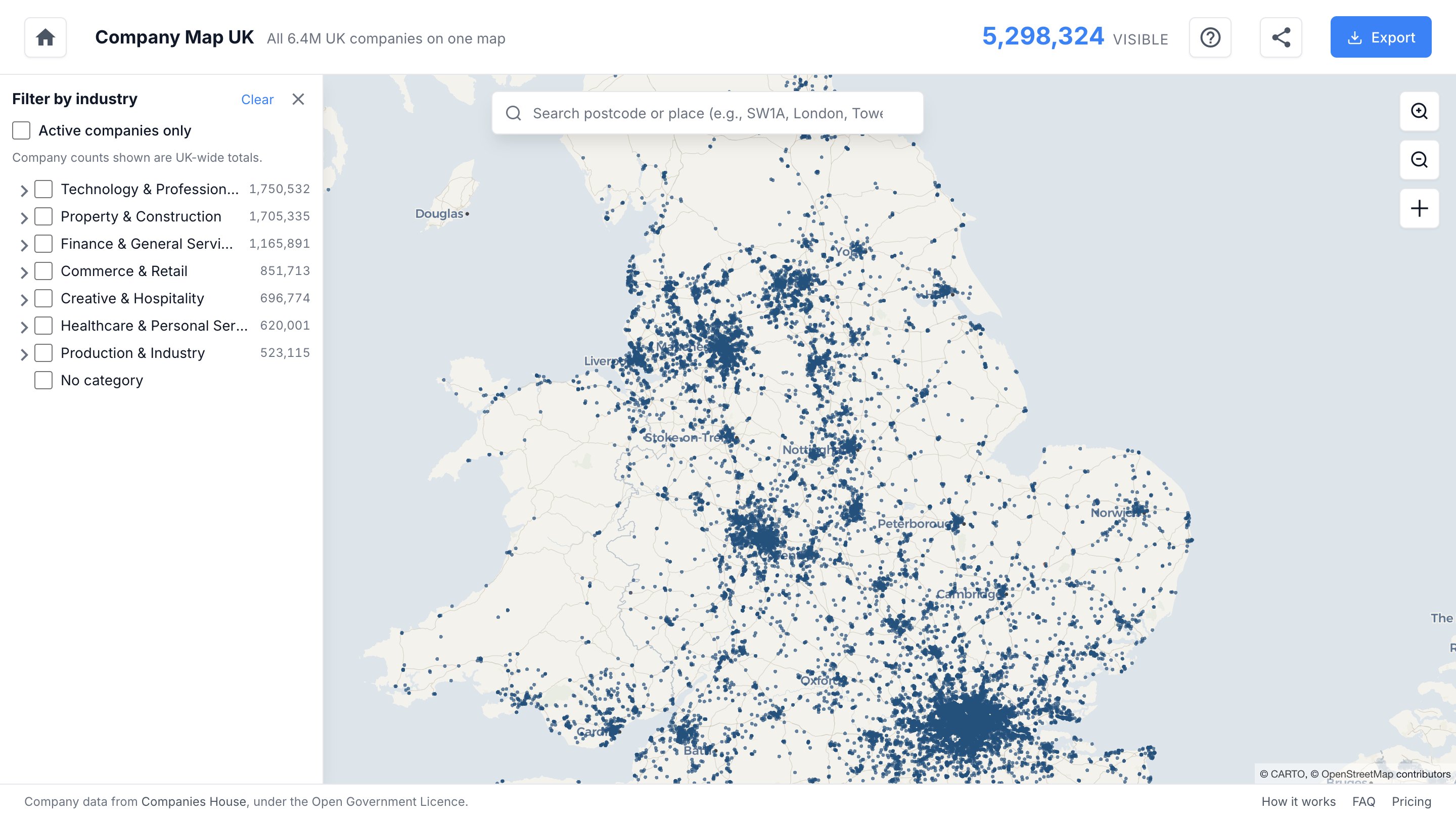
Company Map has a new look. The base map now reads like a calm, printed survey sheet, and the 6.5 million companies on it carry all the colour: navy points on paper, with orange kept for the very densest spots. The site around it has been redesigned to match.
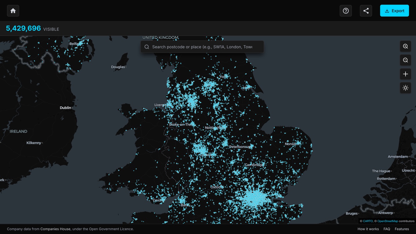
The original map was dark: cyan points glowing on a near-black basemap. It looked striking, but it behaved like a control room, and the glow did the data no favours. Its light alternative had the opposite problem, with points too small to read against a bright base. Both themes competed with the one thing the map exists to show.
Ink on paper
The new base layer takes its cues from printed survey maps rather than screens. Land is a warm off-white, water a muted grey-blue, roads thin tan lines that give texture without demanding attention, and place names sit into the paper in a quiet slate blue. Exactly two chromatic colours remain: navy for the company points and orange as an accent, which only appears where thousands of companies stack on a single address. No glow, no blur, no dark mode. One theme, tuned properly.
Easier to read, easier to tap
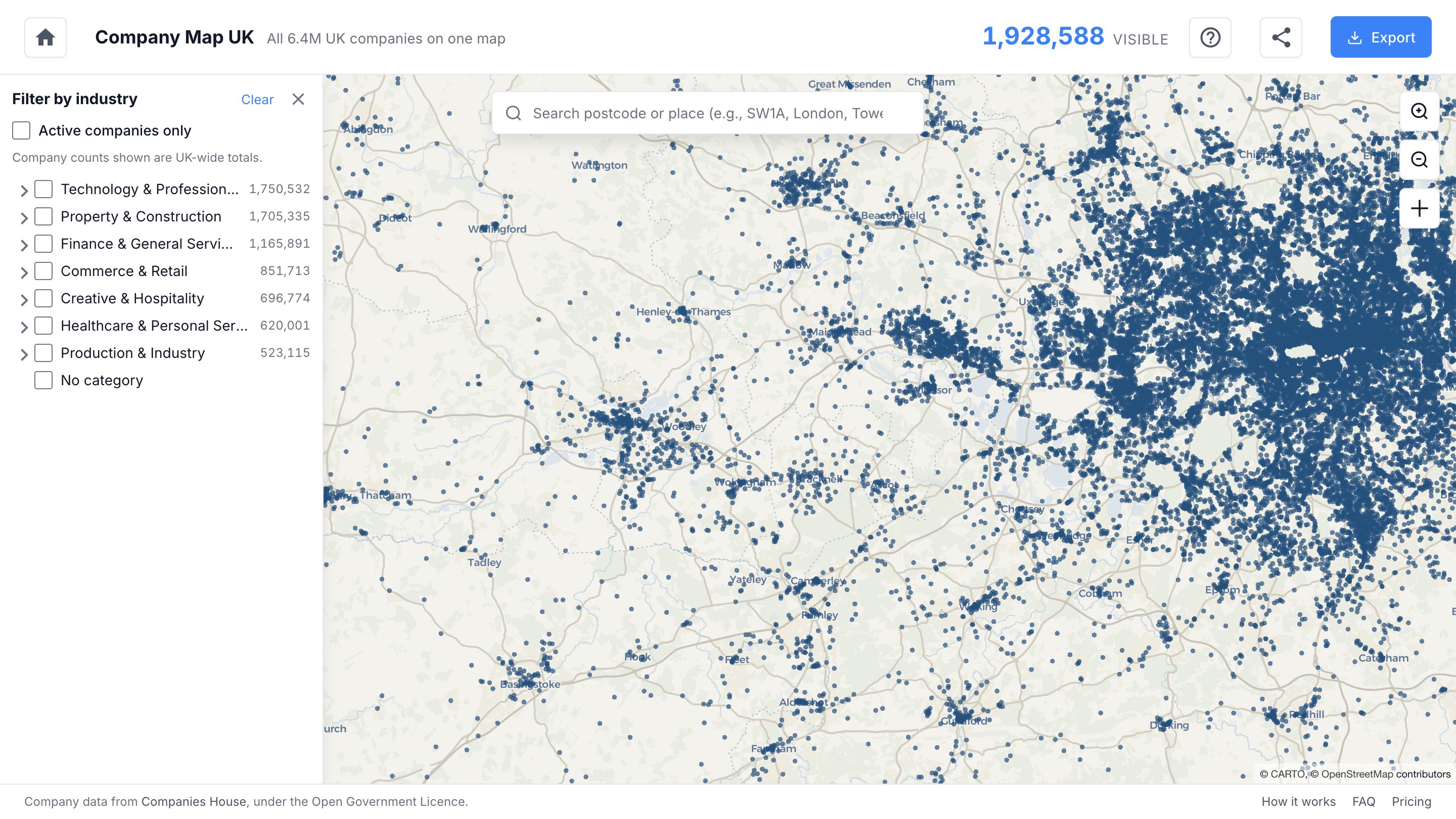
The points themselves are larger at every zoom level, sized so that towns, industrial estates and dense corridors read at a glance without the map turning solid navy. Getting at the numbers is easier too. From district zoom upwards, any point can be tapped for the company count at that address, and taps no longer need to land dead centre. Zoomed further out, a click anywhere estimates the companies around that spot and offers a one-tap zoom towards it.
One design, everywhere
The website now speaks the same language as the map: the same paper surfaces, the same navy and orange, real screenshots instead of illustrations, and a live count of companies in view right in the header. The numbers on the homepage come from the same monthly Companies House refresh as the map, so they stay honest as the register grows.